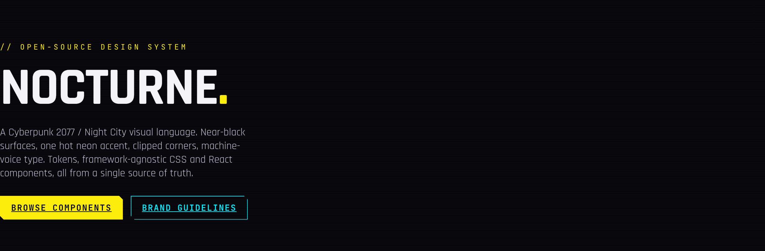
Nocturne: open-source chrome for your whole rig, straight off the Night City streets
Nocturne is an open-source design system chromed off Cyberpunk 2077 and Edgerunners, choom: near-black surfaces, one hot neon accent, clipped corners, machine-voice type, shipped as tokens, framework-agnostic CSS, and React components.
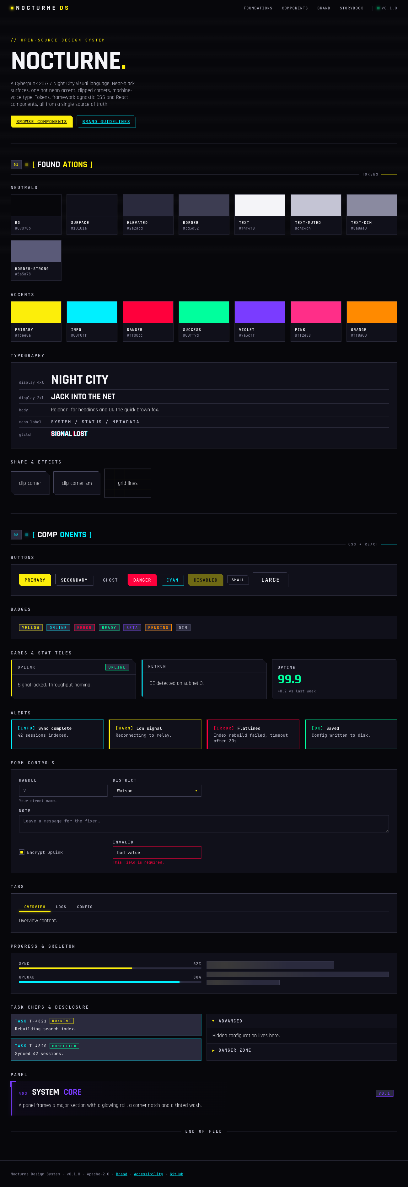
Night City has a look, and now it’s got a rig to match. Nocturne is an open-source visual language chromed off Cyberpunk 2077 and Edgerunners, choom: near-black surfaces, one hot neon accent, sharp clipped corners, terminal-voice type. It ships as design tokens, framework-agnostic CSS, and React components, so you jack in exactly the layer you need. The live styleguide is up if you want eyes on it before reading a line of this.
Why chrome a design system for this?
Cyberpunk interfaces are everywhere in games and film, but almost nobody ships that look as a reusable, accessible, production-grade rig. Most attempts stop at a palette swap and a glow filter, gonk work. Nocturne treats it as an actual design system problem, choom: one source of truth for color, type, spacing, radii, shadows, and motion, with every component built twice, once as plain CSS classes and once as a typed React wrapper over the same classes. Same visual language, either layer, no smoke.
Three layers, jack in what you need
Nocturne splits into three packages on purpose, so adopting it doesn’t mean gutting your whole build:
| Package | What it is | Depends on |
|---|---|---|
nocturne-tokens | Colors, type, spacing, radii, shadows, motion. CSS vars, SCSS, JSON, and typed JS. | nothing |
nocturne-css | Framework-agnostic, class-based components. Plain HTML, zero build step. | tokens |
nocturne-react | Thin, typed React wrappers over the CSS classes. | css + react |
Jack in just the tokens to theme something you already run, drop the CSS into any stack (Vue, Svelte, Astro, plain HTML), or pull the React components straight. Nothing forces a rewrite to get the chrome.
What’s actually in the box
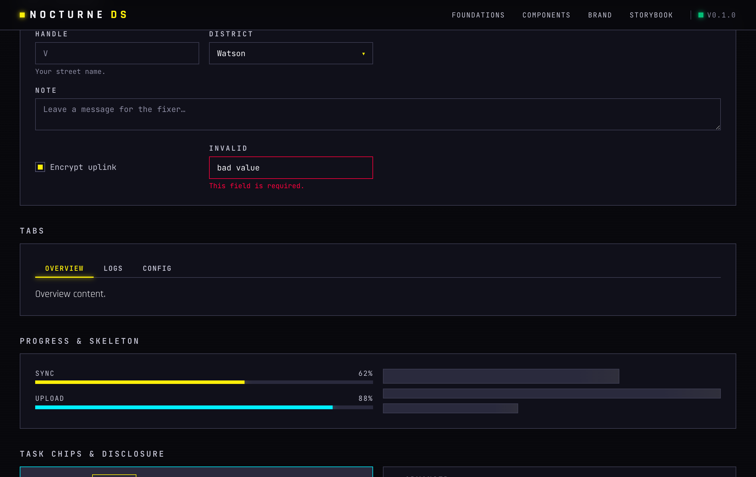
The component count surprised me most for a fresh open-source rig: Button, Badge, Card, Panel, Alert, Input, Textarea, Select, Checkbox, Radio, Switch, Slider, Combobox, Field/Label, Tabs, Progress, StatTile, Divider, Disclosure, TaskChip, SectionHeader, TopBar, Skeleton, Dot, Modal, Drawer, Toast, Tooltip, DropdownMenu, CommandPalette, Table, Tag, Avatar, CodeBlock, EmptyState, Spinner, Breadcrumbs, Accordion, Stepper, Sidebar. Every one exists as both a CSS class API and a React component, choom, no half-built chrome.
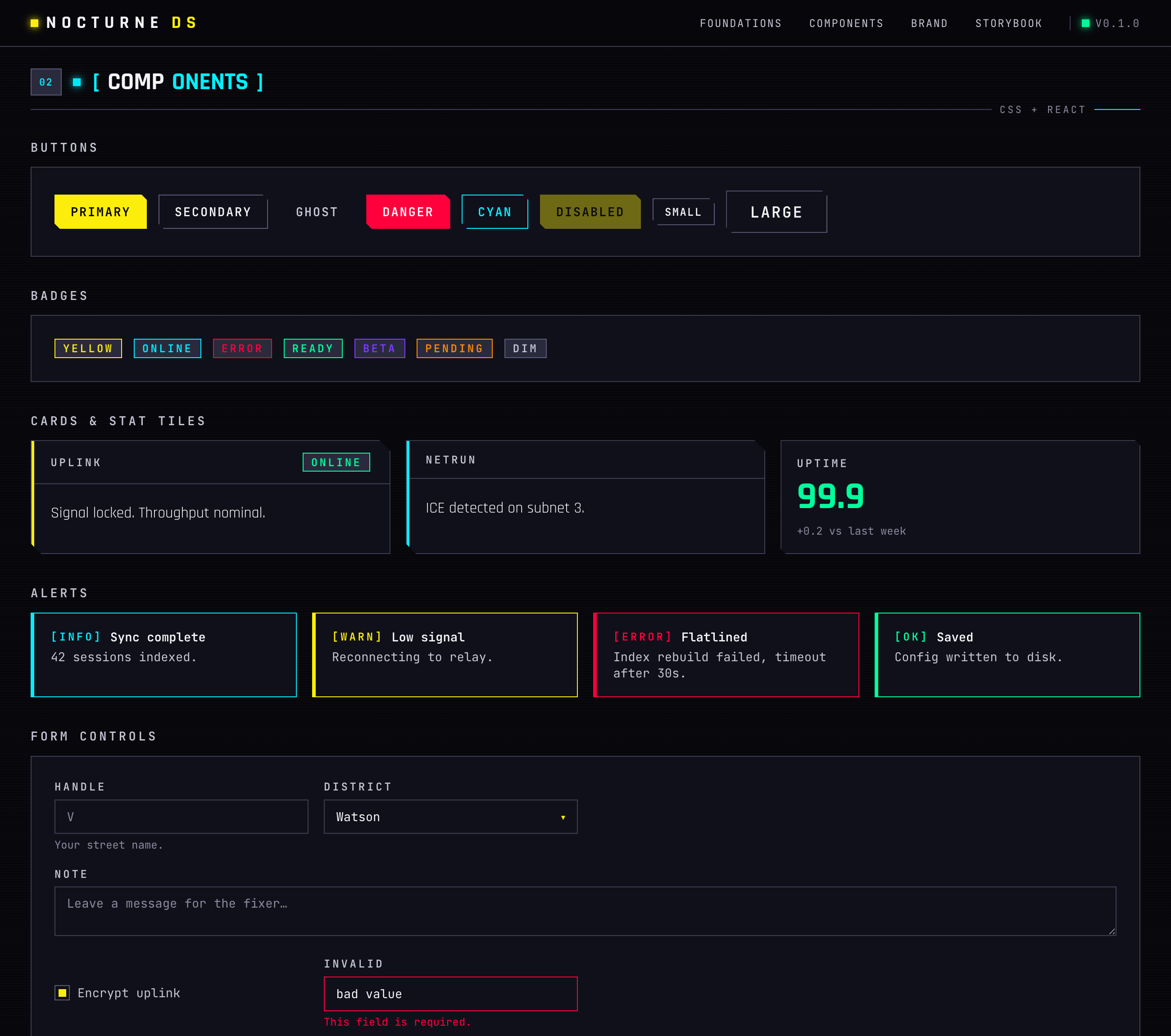
Forms get the same cut: labeled fields, a select styled to match, a textarea, a checkbox, a validation state that reads dead wrong without breaking the look.
Quick jack-in
The framework-agnostic path needs nothing but a stylesheet link and some class names, choom:
<link rel="stylesheet" href="https://unpkg.com/nocturne-css/dist/nocturne.css" />

<body class="noct-root noct-bg-wash noct-scanlines">
  <button class="noct-btn noct-btn--primary">Jack in</button>

  <div class="noct-card noct-card--cyan">
    <div class="noct-card__header"><h3 class="noct-card__title">Uplink</h3></div>
    <div class="noct-card__body">Signal locked.</div>
  </div>
</body>
For React, same drill plus a plain import:
pnpm add nocturne-react nocturne-cssimport "nocturne-css";
import { Button, Card, Badge } from "nocturne-react";
export default function App() {
return (
<Card title="Uplink" accent="cyan" right={<Badge tone="green">online</Badge>}>
<Button variant="primary">Jack in</Button>
</Card>
);
}And if all you want is the raw chrome to wire up yourself, the tokens run standalone:
@import "nocturne-tokens/css";

.thing {
  color: var(--noct-primary);
  border: 1px solid var(--noct-border);
}
import { color } from "nocturne-tokens";
color.primary; // "#fcee0a"Not just a palette swap
The repo ships full brand and design guidelines: logo use, color, type, shape, motion, explicit do/don’t calls, plus a dedicated voice and tone guide and an accessibility page with a real contrast table, not just a promise. Neon-on-black reads preem and fails contrast checks constantly if you’re not sharp about it. Nocturne treats that as ICE against bad ship, choom, not an afterthought.
Under the hood: Rajdhani for display type, JetBrains Mono for the machine-voice text, hand-written BEM-ish CSS with zero runtime, React 18/19 with forwardRef and no styling deps, a static HTML styleguide riding alongside a Storybook workbench. Apache-2.0 licensed, no strings.
Jack in
Browse the live styleguide, read the source on GitHub, or grab the packages straight if you want that Night City look on your own build without reinventing it component by component, choom.